
Range Extension Brand & Packaging
— Chegworth Valley Spark
OVERVIEW
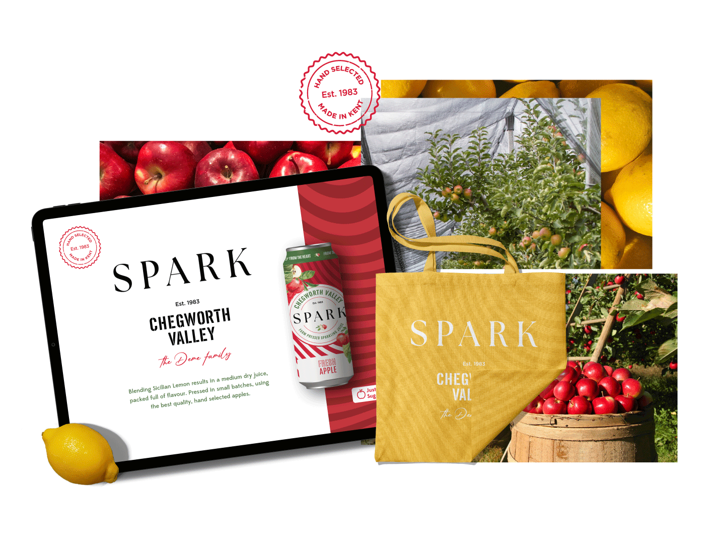
I developed a refreshed brand identity for Chegworth Valley Spark, shifting the brand towards a more illustrative and contemporary direction while drawing on its orchard-led heritage.
I introduced a brighter colour palette and refined typography to create a visual language that feels fresh and contemporary while remaining distinctly Chegworth.
The identity was developed to support a potential range extension, enabling a more expressive, product-led brand direction.
ROLE
Brand & Packaging Designer
CREDITS
Geobrand Agency
— 2023
Visual System
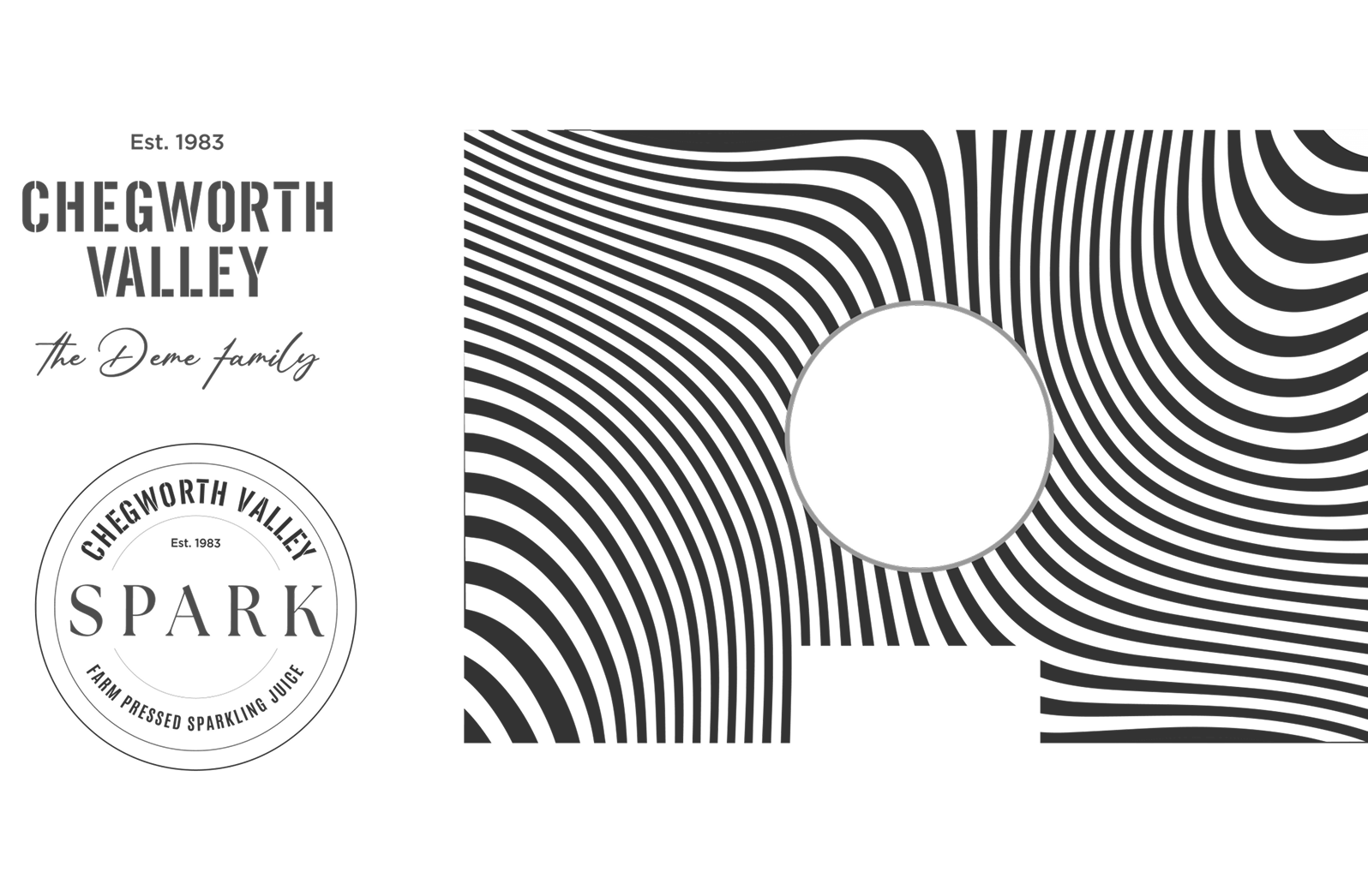
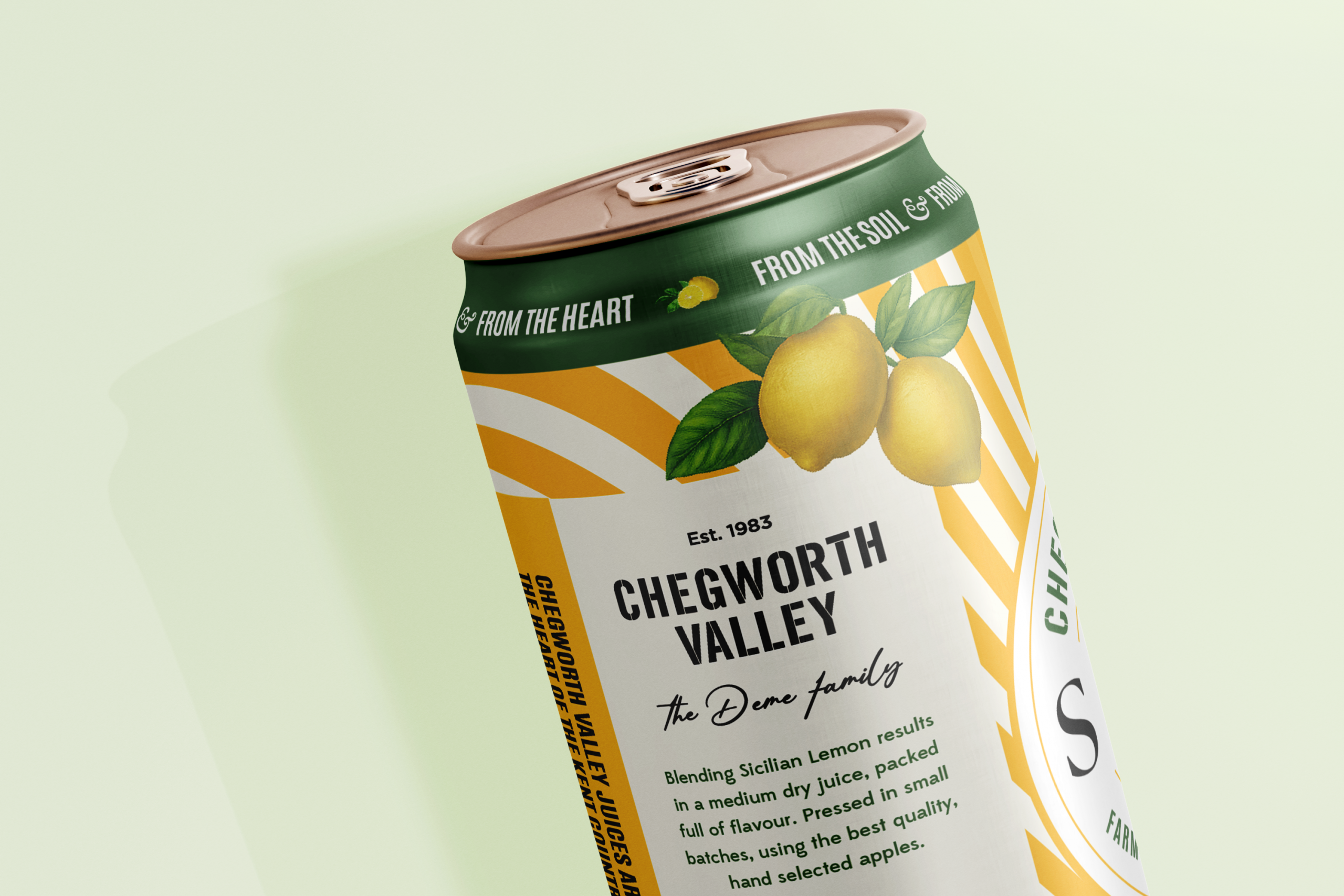
I developed the identity around Chegworth Valley’s orchard-led heritage, shifting away from the parent brand’s photography and pattern-led approach towards a more illustrative direction.
A brighter colour palette and considered typography establish a visual language that feels fresh and contemporary while remaining distinctly Chegworth.
Packaging System
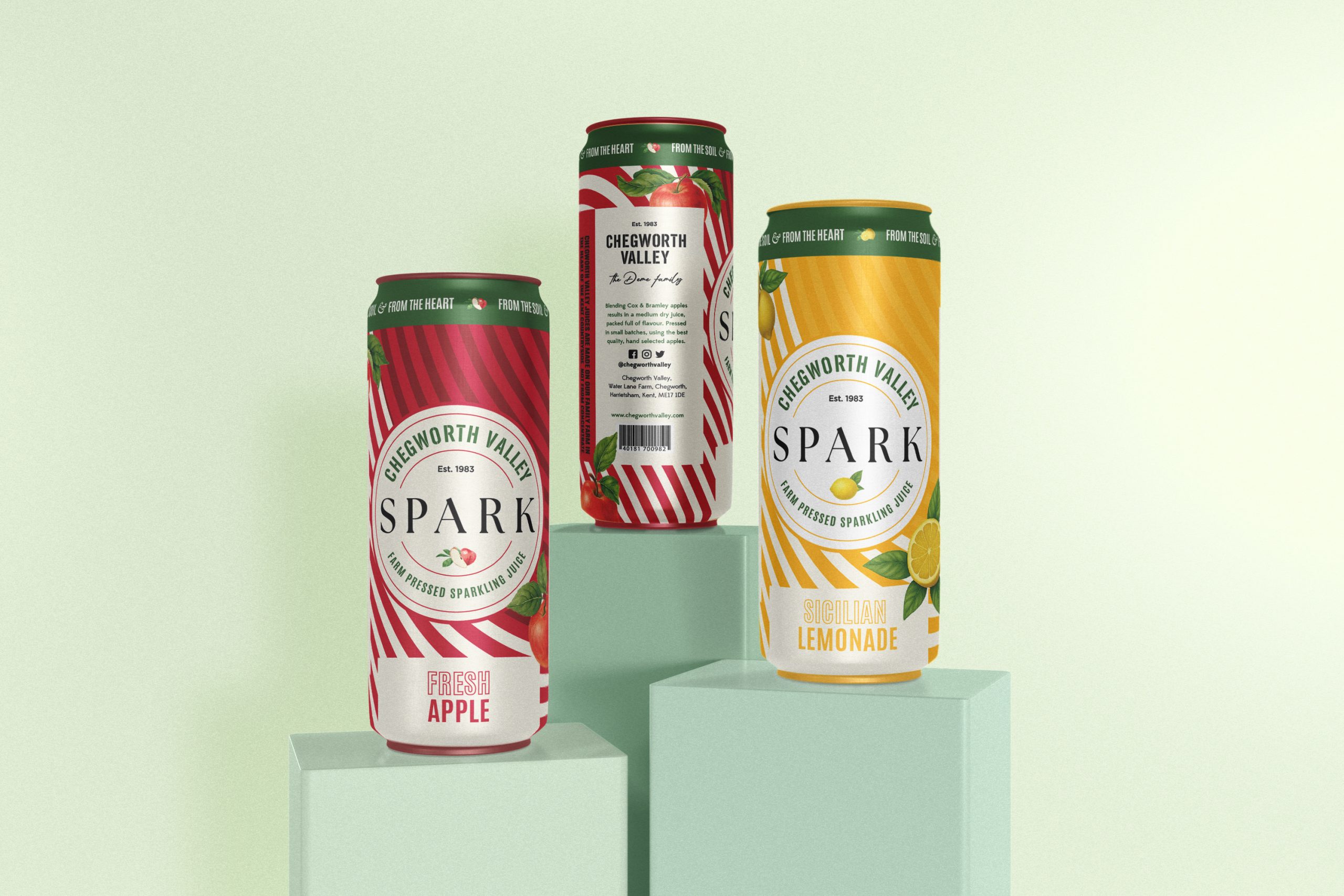
I designed the packaging system to scale across the range, using colour and layout to differentiate flavours while maintaining consistency at shelf.
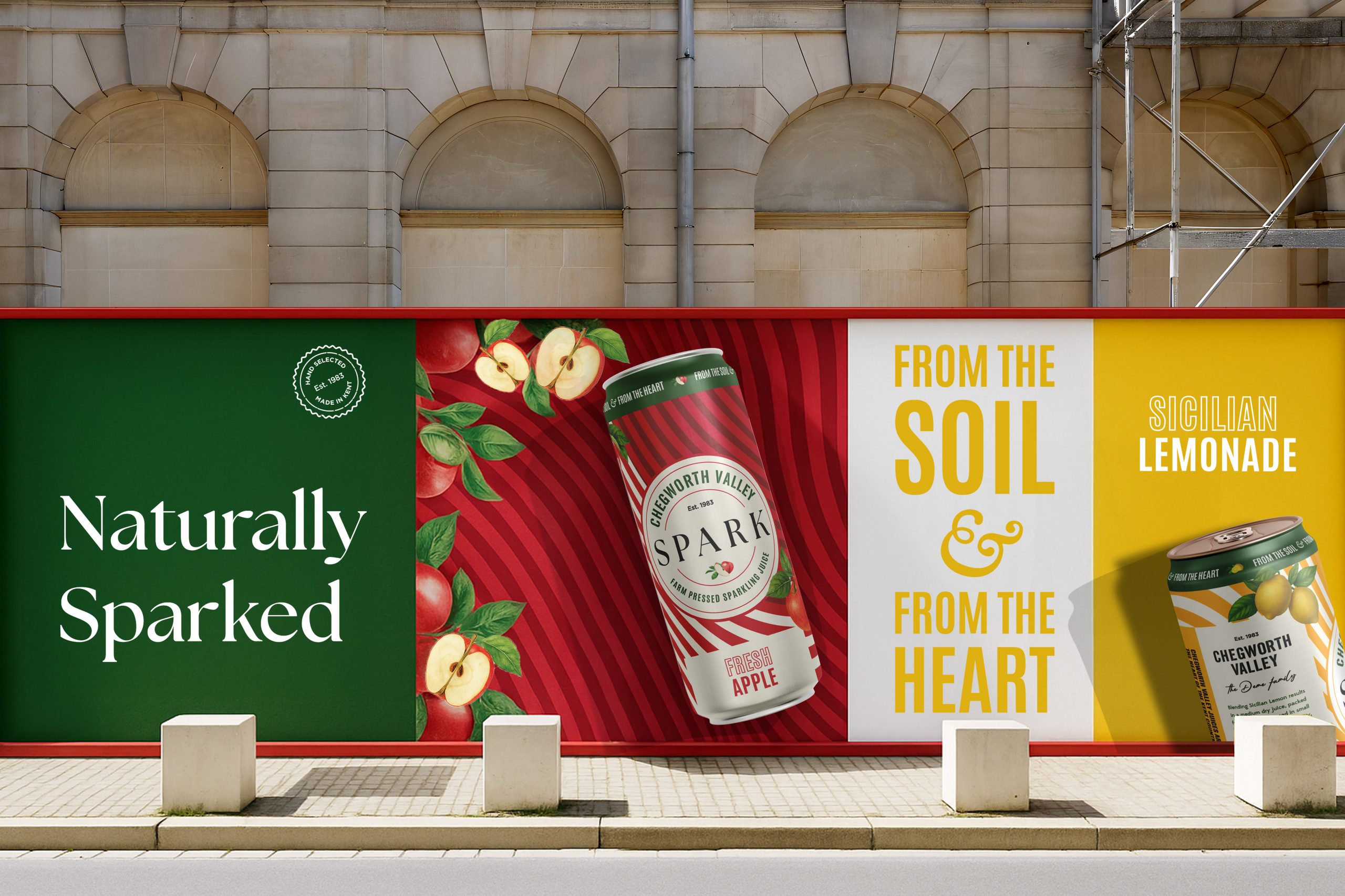
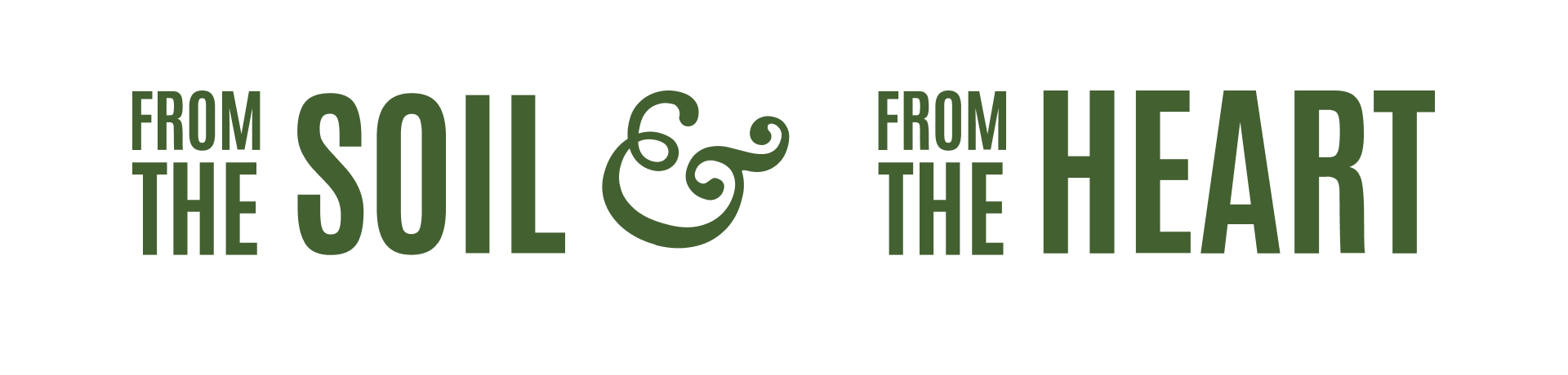
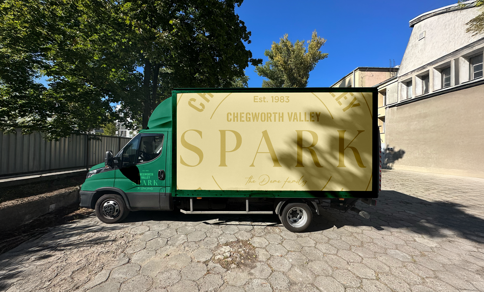
The identity extends beyond packaging into a broader visual language, combining typography, pattern and brand elements to create a cohesive system across digital and physical touchpoints.
Outcome
The system was designed to scale across the Spark range, with applications extending into social and out-of-home to support the brand’s entry into the sparkling drinks category.
Let’s create your next campaign
Campaign systems for fashion and e-commerce, built for clarity, consistency and performance.